Thursday 14 April 2011

Black and White Art


             Fashion linked with Graphics


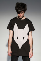
Alot of my Graphic design work comes from what I wear. It may sound weird but its true. I tend to stick to '2 colours' maximum for a plain tee or jumper and normally it is Black and White. My Graphic Design work has gained from this is the "Simpleness of some fashion has rubbed off into my designs"
                                    
      The long clothing label is the range that produces most black and white designs.
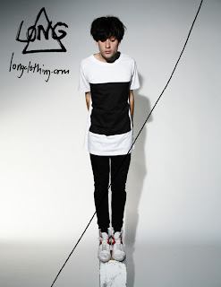


All of these designs are pretty simple yet all look so cool. This is because black and white is such a good combination its hard to fault.  All of the images on the clothing is very graphic based aswell which gives it that slick, different look.

New World Symphony Logo. Michael Bierut


http://bcove.me/fs7kli4k


This video shows how the first initial ideas and rough sketches come together to make a amazing logo. I felt the steps that Michael Bierut went through were amazing, how he transformed his N, W, S into sound waves is beyond me. A excellent piece of design and works well as a standing logo on the Academy Building and various other products.

Octopus Character


I find the style of this character brilliant. It is very simple but the unusual green colour used has made this nice along with the thick strokes used around the edges. Alot of my work has a similar sort of style used.

3D Business Cards


3D Business Cards

To be remembered within design, be quirky, unique and professional

These might not be totally professional but it certainly made me interested. 3D business cards wont come cheap. Seeing this will certainly make me think differently when designing my own. 

Graffiti Street Art


Graffiti Street Art

Normally related to gangs, rebels and youngsters who treat the streets with disrespect and anger. Agreed that on some levels this is true but on others it still is design. But when i seen this picture of some street graffiti i couldn't help but accept that this is raw talent and design and shows that Graffiti can be linked with Graphics and Traditional Art. 


Projection Advertising

Design is all about whats new, interesting and attracts peoples attention. But there is one thing about Projection Advertising. It is certainly unique, fresh and extremely expensive, it is used for logos, companies and designs. When i seen this it caught my attention and i felt it should be blogged as i can see this becoming huge within design in the future.

Budweiser Bottle Clock


In the 21st Century all we hear is about GREEN this and GREEN that. Seeing this recycled bottle used as a clock, i thought this was certainly one way of using GREEN DESIGN.

Paper Nose Cup

Most people think these are cool, but some would say a waste of MONEY .But it is one way of bringing design into everyones lives.

The Hoody Chair


Colour Contrast & Eye Catching Design

2 Colours, 1 Contrast, 1 Idea

Make you look Twice


Using Fitness with Design = A Quirky Idea


      Makes me want to drink a glass now!


Really Gets the Message Across in a clever way 

Creative CV


If your wanting to be remembered and stick in an employers head then this is a perfect example of thinking out the box. This must have set him back a bob or two but would be worth it at the end of the day.

Seaton Sluice, Primary School Logo


This was a Primary School logo I had to create with specific guidelines. It was going to be stitched onto a navy jumper so had to stick to a certain colour palette which had to have yellow in it. I felt by having a simple design inside worked well, clean enough typeface and easily read.

Green Home.


THINKING OUTSIDE THE BOX

IF THIS CAN BE DONE IN ARCHITECTURE, THIS CAN BE DONE IN GRAPHICS TO

London Police


LONDON POLICE


The london Police graffiti is not any normal graffiti its has character which i love. The characters are used in all of their work, I sometimes use these for ideas and styles for some of my projects.

Opera Poster by This is Real Art


This piece of Typography is fantastic. A find this piece really inspiring as the letter V is a triangle upside down which works with the title 'Love Triangles'. That extra colour on the triangle gives is that unique effect. All the letters look part of a logo even though they are different shapes the thinness of the stroke runs throughout the design. 

Kayne West Album Cover


SIMPLICITY

The Kayne West Album cover here is very simple yet so effective. I like the red shaped heart in the centre of the page as i feel this makes the feel of the cd so subtle, but we all know Kayne West's music is anything but subtle that is how it works.

Austin Kleon


This is a great piece of artwork from Austin Kleon. The word 'but' and 'the' actually look like there sinking, this is great!

Radiohead's Thom Yorke by Steve Yee


TRULY INSPIRING!

This piece of artwork is amazing. How a design can be made up with typography as detailed as this is crazy, the time and effort that has been put into this must be incredible. 

Blue Bridge


This piece is for Newcastle College. They needed a logo that would work as a record label for the whole section of music. This was tricky as there are different genres of music so a logo would have a different style if it was a dance band to a rock band, so had to keep it really simple.

My favourite aspect of designing is creating characters like this cool dude here.  I have a real passion for creating random characters but i find it really interesting and can make a boring piece of work look good


INNOCENT

The Innocent Smoothie range has grew to be one of the most successful brands in the world. The word  Innocent shows its actual petit appeal. It is very simple thats the good thing about it.  The size of the bottle is perfect aswell, and not only do they target the younger generation but adults love them too!


WHOSE HAND ARE YOU HOLDING!

I feel this piece of design is extremely clever. This is portraying the message of use the Dettol hand liquid unless you can catch all sorts. So by having the plastic rails as hands this shows you never know who has been touching what!

AD 206 Negotiated Project

Stationary Set


Editorial Piece


This Project was for us to make our own. I had the choice to pick anything in the world to design for, i chose to produce a Gym Logo. I wanted it to be as clean and fresh looking as possible unlike alot of them out their today. I came up with the Circles as my main design as it represents the Muscles Toning together.


Life is the art of drawing without an eraser.
   John Gardner